Ghislain wrote:The first one (title screen) is 22*25, but the second one is 23*26 -- which is the one we're really concerned about. It looks a little bit cut off in the upper right corner there, but it looks like it's still useable. The NTSC screen size has less room to play with than PAL.
Not much else we can do about this. If I decrement the horizontal positioning register by one (including the then necessary changes to the raster routine) the entire view would shift four pixels to the left, and then it would crop the corners on the left-hand side.
As long as no-one complains over an entire missing row or column (but with enough leeway to the other side) I suppose we can leave it at that.
I say leave it as is, as well.
Those TV photos bring back memories. As much as I find modern flatscreen TVs more convenient, there is something about CRTs that give a certain warmth and glow to a TV or computer game image.
"A slave is one who waits for someone to come and free him." -- Ezra Pound
Ghislain wrote:The first one (title screen) is 22*25, but the second one is 23*26 -- which is the one we're really concerned about. It looks a little bit cut off in the upper right corner there, but it looks like it's still useable. The NTSC screen size has less room to play with than PAL.
Not much else we can do about this. If I decrement the horizontal positioning register by one (including the then necessary changes to the raster routine) the entire view would shift four pixels to the left, and then it would crop the corners on the left-hand side.
As long as no-one complains over an entire missing row or column (but with enough leeway to the other side) I suppose we can leave it at that.
I say leave it as is, as well.
Those TV photos bring back memories. As much as I find modern flatscreen TVs more convenient, there is something about CRTs that give a certain warmth and glow to a TV or computer game image.
I enjoy playing my vic on that little guy. It feels so much more authentic than on a flat screen.
I don't think anyone will complain about the 2 or 3 pixels getting cut off. It does not look like it should interfere with any of the game graphics. Just a little bit of empty window space.
At the risk of engaging in feature creep, I figure that since side 1 of the game deals with the booting the game, starting at the castle (for character creation and equipping your new party) as well as traveling on the world map, I figure there is just enough room to include 32 portraits of the 16 races (male and female) to be shown while you create and roll a new character:
Do you guys think that putting in a feature like this be a bit excessive?
"A slave is one who waits for someone to come and free him." -- Ezra Pound
Yeah, precisely. The speech in Impossible Mission was added because it was something Dennis wanted to try out and there was room left in the code to accommodate it, and it's one of the first things people remember about the game! It just adds to the experience and "professionalism" of the presentation if there's room for it
Of course I'm going to cram as much graphics (thanks to Mike's excellent tools) and music (that R'zo is working on) as possible. If you can provide large quantities of really beautiful content, then why not do it. Something like this has never been done for the VIC-20 platform and I want to see it through. Realms IV had a large quantity of digitized images, but they were just in black and white. This time, they will be that much better.
I revised the abilities for the 16 races -- I found some of them far too powerful and I was worried that people would just create a party made up entirely of Eldars and Dunedains. So for the sake of balance, here are their revised numbers:
Last edited by Ghislain on Thu Mar 02, 2017 8:02 am, edited 1 time in total.
"A slave is one who waits for someone to come and free him." -- Ezra Pound
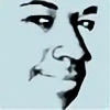
These portraits are gorgeous!
The only one I didn't like so much is the really tilted head, but I think that's because the aspect ratio of the screenshot is wrong.
Kweepa wrote:These portraits are gorgeous!
The only one I didn't like so much is the really tilted head, but I think that's because the aspect ratio of the screenshot is wrong.
Thank you!
I just finished my work on the dwarf portraits:
"A slave is one who waits for someone to come and free him." -- Ezra Pound
Kweepa wrote:These portraits are gorgeous!
The only one I didn't like so much is the really tilted head, but I think that's because the aspect ratio of the screenshot is wrong.
How about this one:
"A slave is one who waits for someone to come and free him." -- Ezra Pound