Playing with my NTSC VIC20 on an ancient B&W monitor, I've figured out that graphics of a resolution of up to 336x240 is possible..sort of.
The Apple 2 used bitmap graphics to implement color graphics at a lower resolution. My idea is to go the other way--use color graphics to implement bitmap graphics at a higher resolution.
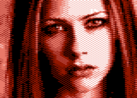
On an NTSC VIC20, a solid green color appears as an alternating crosshatch pattern. By alternating the font each field, you can get sub-pixel graphics (this has a low CPU impact). Each character now has an effective resolution of 14x8. There's a strange problem--the pixel grid is 8 wide while the chroma mask grid is 7 wide...they don't line up properly. This means that you only get "true" pixel-by-pixel graphics for about half the width of each character.
If you're implementing sprite graphics, then you can get around this problem by using small sprites and using cyan or yellow instead of green to line up the chroma mask where required. This would work well for an asteroids type game, giving an effective resolution of 384x240 (twice the pixel grid, rather than twice the chroma mask grid).
But that trick won't work for an 80 column text mode. I think that a true 80 column text mode using sub-pixel graphics may be possible, but it will require fiendishly clever font design.
In principle, this method could be combined with interlaced mode to double the vertical resolution, but this requires the use of a very long persistence monitor or some sort of "flicker-fixer", and it reduces true refresh rate down to 15hz. I think it's too problematic.
Sub-pixel graphics idea
Moderator: Moderators
-
Mike

- Herr VC
- Posts: 4845
- Joined: Wed Dec 01, 2004 1:57 pm
- Location: Munich, Germany
- Occupation: electrical engineer
1. There's a quite popular S-Video mod in use, which separates Luma & Chroma. This also eliminates the cross-hatch patterns you intended to use.
2. While it is generally interesting to use the hardware to the max, even a fairly good documented -- working! -- 160x192 fully bitmapped hires mode nearly ends up unused. Why should a hypothetical bigger hires mode fare better in this regard?
<rant>
One might come to the conclusion, that it is a big thing to discover a certain hardware effect, but if it involves design (well, a hires bitmap gives a lot flexibility - but it's your task to set the pixels) the interest of the programmer drops off.
For my part, I'm not overly impressed by any raster-bar effects any more. I already coded them myselves over 20 years ago.
</rant>
Michael
P.S.: incorporating the OP in the 80 columns thread would well have been within normal topic drift.
2. While it is generally interesting to use the hardware to the max, even a fairly good documented -- working! -- 160x192 fully bitmapped hires mode nearly ends up unused.
<rant>
One might come to the conclusion, that it is a big thing to discover a certain hardware effect, but if it involves design (well, a hires bitmap gives a lot flexibility - but it's your task to set the pixels) the interest of the programmer drops off.
For my part, I'm not overly impressed by any raster-bar effects any more. I already coded them myselves over 20 years ago.
</rant>
Michael
P.S.: incorporating the OP in the 80 columns thread would well have been within normal topic drift.
I don't think there's any hope of it being a "popular" effect, because it involves:
a) An NTSC VIC20
b) A true composite B&W NTSC monitor
and
c) A VIC20
And due to the misalignment of the crosshatch rate and the pixel rate, a true 80 column mode would be...challenging. If someone can figure out how to do it at all, the technical challenge alone might be justification enough.
But I think it's more suitable for a sprite game, to greatly improve the appearance of the sprites. In particular, the default fatness of pixels is not good for an asteroids type game where you'd like small sprites which look good at all rotations. It's a little eye-popping to see these little sprites with the same detail level as a C64 sprite.
(Since this effect is entirely different from, and incompatible with the idea in the 80 column thread, I didn't include it there.)
Oh! Your mention of "S-Video" mod makes me realize a way to get around the B&W monitor requirement.
You do a "reverse" S-Video mod. Instead of converting the VIC-20 to output full color S-Video, you attach the standard composite output to the Luma signal of an S-video cable. This essentially turns any TV into a B&W monitor.
Thus any TV with S-video input can be used as a B&W monitor, with those crosshatch patterns visible.
-
Mike
- Herr VC
- Posts: 4845
- Joined: Wed Dec 01, 2004 1:57 pm
- Location: Munich, Germany
- Occupation: electrical engineer
The cross-hatch patterns also appear on an unmodded PAL VIC-20.
They are clearly a by-effect of the mixing of Chroma & Luma before they're sent to the video output port.
On the C64, the VIC-II chip synthesizes a near sine waveform to produce the Chroma-signal, which doesn't include higher frequency harmonics. This Chroma can be filtered out effectively by a colour TV set, and doesn't catch ones eyes that much on a B/W telly.
On the contrary, the VIC-20's VIC-I only produces a square wave Chroma. While it also gives the necessary phase, and amplitude information to signal colour, and saturation, its harmonics distort the luminance information. Ultimately, this leads to these exaggerated cross-hatch patterns, unless Chroma & Luma are separated.
In the meanwhile, these are two pictures, which simply use what's available, and actually work:

(those are currently stored on my Skydrive, there are some more lurking on my HD).
They are clearly a by-effect of the mixing of Chroma & Luma before they're sent to the video output port.
On the C64, the VIC-II chip synthesizes a near sine waveform to produce the Chroma-signal, which doesn't include higher frequency harmonics. This Chroma can be filtered out effectively by a colour TV set, and doesn't catch ones eyes that much on a B/W telly.
On the contrary, the VIC-20's VIC-I only produces a square wave Chroma. While it also gives the necessary phase, and amplitude information to signal colour, and saturation, its harmonics distort the luminance information. Ultimately, this leads to these exaggerated cross-hatch patterns, unless Chroma & Luma are separated.
How would you go placing several different colours within one character, so the cross-hatch pattern effectively can be put to use? Multicolour forces twice-wide pixels. Effectively, the resulting rules for designing characters with the cross-hatch pattern in mind are so complex, they are of no use.IsaacKuo wrote:But I think it's more suitable for a sprite game, to greatly improve the appearance of the sprites. In particular, the default fatness of pixels is not good for an asteroids type game where you'd like small sprites which look good at all rotations. It's a little eye-popping to see these little sprites with the same detail level as a C64 sprite.
In the meanwhile, these are two pictures, which simply use what's available, and actually work:
(those are currently stored on my Skydrive, there are some more lurking on my HD).
Last edited by Mike on Fri Dec 14, 2012 1:39 pm, edited 1 time in total.
I don't know how it works with PAL models, but the crosshatch patterns I see using the VIC20 look identical to the ones on the C64/C128 and Amiga (NTSC models). I don't think it's a square wave in any of them, but in any case it's good enough for this effect.
With a C64 or Amiga, an identical effect can be accomplished by swapping graphics each field, but it's not necessary since they're already capable of 320 pixel resolution natively. On a C64 or Amiga, the pixel clock is aligned with the chroma frequency, rather than being off by a 7:8 ratio (as in the VIC20). That would make it easier to program, but it's pretty pointless to begin with.
The reason the VIC20, C64, and Amiga look good on a B&W monitor even with the composite output is that the pixels alternate phase 180 degrees each field. Essentially, the crosshatch inverses each field. A lot of other machines don't do this--like the Apple II, IBM CGA graphics, NES, SNES...leading to obvious color fringing effects. Of course, in the case of the Apple II this was on purpose.
You could boost the usable width across the border between two characters, since you can use two different colors, but this is too restrictive on horizontal placement for sprites (may be suitable for vertical background walls).
With a C64 or Amiga, an identical effect can be accomplished by swapping graphics each field, but it's not necessary since they're already capable of 320 pixel resolution natively. On a C64 or Amiga, the pixel clock is aligned with the chroma frequency, rather than being off by a 7:8 ratio (as in the VIC20). That would make it easier to program, but it's pretty pointless to begin with.
The reason the VIC20, C64, and Amiga look good on a B&W monitor even with the composite output is that the pixels alternate phase 180 degrees each field. Essentially, the crosshatch inverses each field. A lot of other machines don't do this--like the Apple II, IBM CGA graphics, NES, SNES...leading to obvious color fringing effects. Of course, in the case of the Apple II this was on purpose.
I wouldn't. Using a solid color, you only get about 5-7 usable half-pixels width. The pixels near the sides are getting out of phase. This is enough width for a small sprite suitable for asteroids type games.How would you go placing several different colours within one character, so the cross-hatch pattern effectively can be put to use?
You could boost the usable width across the border between two characters, since you can use two different colors, but this is too restrictive on horizontal placement for sprites (may be suitable for vertical background walls).
-
Mike
- Herr VC
- Posts: 4845
- Joined: Wed Dec 01, 2004 1:57 pm
- Location: Munich, Germany
- Occupation: electrical engineer
Ah, I oversaw that in your earlier post. On a PAL VIC-20, pixel clock & chroma are aligned. If I plot a vertical green line on white, the result looks like this regardless of horizontal positioning:IsaacKuo wrote:On a C64 or Amiga, the pixel clock is aligned with the chroma frequency, rather than being off by a 7:8 ratio (as in the VIC20).
Code: Select all
 **
*  *
 **
*  *
 **
* *Does the crosshatch pattern alternate each field or does it just stay rock steady?
Either way, that alignment is the worst for the desired effect. You might use it for pseudo 640-wide HIRES resolution, but with weird restrictions on the small pixels.
How do yellow and cyan look? Ideally, they should be appear as this:
In other words, they are inverses of each other, and they produce staggered 320-wide HIRES pixels. That way, you have a solid black foreground and you alternate the background color between yellow and cyan each field (while also alternating the font).
That's assuming that the PAL VIC does not alternate chroma phase each field, so you have to alternate the crosshatch pattern yourself.
Either way, that alignment is the worst for the desired effect. You might use it for pseudo 640-wide HIRES resolution, but with weird restrictions on the small pixels.
How do yellow and cyan look? Ideally, they should be appear as this:
Code: Select all
**        **
  **    **
**        **
  **    **
**        **
  **    **
**        **
** ** That's assuming that the PAL VIC does not alternate chroma phase each field, so you have to alternate the crosshatch pattern yourself.
-
Mike
- Herr VC
- Posts: 4845
- Joined: Wed Dec 01, 2004 1:57 pm
- Location: Munich, Germany
- Occupation: electrical engineer
They're rock steady. Yellow, and blue look like this:
i.e. there's only a small shadow to the side of each single pixel, it's nearly unnoticable. Purple, red, and cyan look similar to the green pattern above.
Code: Select all
** *
** *
** *
** *
** *I really don't understand how PAL works. My guess is that there's actually some sort of 50hz pattern alternation but it looks steady. Otherwise, how is it possible for the exact same signal to produce both yellow and blue?
And the green line pattern corresponds to only two different signals--enough to explain green and purple, but not also red and cyan.
One thing that may help you see what's going on is to plot vertical lines of various colors against black instead of white. You could test using something like this:
For the vertical lines, you use the different vertical line characters so you get a full variety of alignments.
This will black out the character graphics every other field, and reveal if there is any alternating pattern.
The other possibility I see is if perhaps PAL graphics is implemented by slightly shifting the pixels left/right. Thus, yellow and blue might look the same but they're actually horizontally offset from each other.
And the green line pattern corresponds to only two different signals--enough to explain green and purple, but not also red and cyan.
One thing that may help you see what's going on is to plot vertical lines of various colors against black instead of white. You could test using something like this:
Code: Select all
1 c=TESTCOLOR*16+8
10 print"{clr}"
11 print "{rvs on}{blk} |||||||| {wht}{rvs off}"
12 print "{rvs on}{blk} |||||||| {wht}{rvs off}"
13 print "{rvs on}{blk} |||||||| {wht}{rvs off}"
14 print "{rvs on}{blk} |||||||| {wht}{rvs off}"
20 w=36868:v=128
30 waitw,v
40 poke36879,c
50 waitw,v
60 poke36879,8
70 goto30
This will black out the character graphics every other field, and reveal if there is any alternating pattern.
The other possibility I see is if perhaps PAL graphics is implemented by slightly shifting the pixels left/right. Thus, yellow and blue might look the same but they're actually horizontally offset from each other.
-
Mike
- Herr VC
- Posts: 4845
- Joined: Wed Dec 01, 2004 1:57 pm
- Location: Munich, Germany
- Occupation: electrical engineer
Indeed, the cyan/red, and green/purple patterns are not quite the same.
Currently, I don't have any TV set + VIC-20 at hand. Thus the following patterns are more qualitatively meant, they're from memory:
That means parts of the pixels stray into the neighbors. With two of more consecutive horizontal pixels, the gaps only appear on the left and right end.
Even, and odd lines of yellow do have slightly different hues. One line is more greenish, the other looks more like pure yellow, giving an overall slight greenish yellow. This also applies to the other colours.
Edit: here's a good frame grab, courtesy Bacon:
So I got even, and odd lines the wrong way with cyan, and red.
Since my VIC looks equally bad, I also will do the S-Video mod. When I have spare time for this.
Currently, I don't have any TV set + VIC-20 at hand. Thus the following patterns are more qualitatively meant, they're from memory:
Code: Select all
 |   |  <- single pixel width
|******|  black, odd line
|******|  black, even line
|      |
|**   *|  yellow
|**   *|
|      |
|  *** |  blue
|  *** |
|      |
| ***  |  red
|*   **|
|      |
|*   **|  cyan
| ***  |
|      |
|  *** |  purple
|**   *|
|      |
|**   *|  green
| *** |Even, and odd lines of yellow do have slightly different hues. One line is more greenish, the other looks more like pure yellow, giving an overall slight greenish yellow. This also applies to the other colours.
Believe me, they are steady. In that regard, I happen to have a rather sensitive vision. A refresh rate of 50 Hz looks to me like a flip-book. On a CRT, I need a refresh rate of at least 85 Hz for not to see any flicker anymore.My guess is that there's actually some sort of 50hz pattern alternation but it looks steady.
Edit: here's a good frame grab, courtesy Bacon:
So I got even, and odd lines the wrong way with cyan, and red.
Since my VIC looks equally bad, I also will do the S-Video mod. When I have spare time for this.
Thanks! I appreciate the explanation. That makes sense. I couldn't believe that yellow and blue had exactly the same signal.
The option which would be easiest to program would be alternating the color between yellow and blue. This lets you "interlace" the pixels horizontally for doubled horizontal resolution.
The red/cyan or purple/green options may look better, though, because the interlacing is with interleaved checkerboard patterns rather than vertical stripes.


-
Mike
- Herr VC
- Posts: 4845
- Joined: Wed Dec 01, 2004 1:57 pm
- Location: Munich, Germany
- Occupation: electrical engineer
Yeah, one can speculate so much... However, if even the initial thoughts are doubtful, you won't get any meaningful results:
336x240 pixels, as 1bpp bitmap, do need 10080 bytes. There are only 5K built-in RAM which the VIC-I chip has access to, besides the character ROM. If you want to define the pixels freely, you must make the RAM available. You can't get the information out of thin air. And a display, where one pixel is dependent on another pixel, you can't call a bitmap.
Those 5K are already needed to produce a full-screen B/W bitmap. The emphasis lies on full-screen. NTSC interlace might increase the pixel density, but it can't increase the pixel number. Overlaying different screens (possible on PAL and NTSC) might provide increased colour resolution, but then, this claims memory needed to display the pixels themselves.
The cross-hatch patterns are a by-product of a non-perfect video circuitry. With luma & chroma separated, they vanish, and the visible output of VIC-I comes nearer to specification. As I already wrote above:
That's the reason computer graphics went from text-screens to bitmapped displays, ultimately capable of assigning any of 16M colours to any pixel. Of course, no reason to stop here. Why not 10 bits per colour channel? Holographic displays?
Michael
The 'sort of' is, what rescues you here.Playing with my NTSC VIC20 on an ancient B&W monitor, I've figured out that graphics of a resolution of up to 336x240 is possible..sort of.
336x240 pixels, as 1bpp bitmap, do need 10080 bytes. There are only 5K built-in RAM which the VIC-I chip has access to, besides the character ROM. If you want to define the pixels freely, you must make the RAM available. You can't get the information out of thin air. And a display, where one pixel is dependent on another pixel, you can't call a bitmap.
Those 5K are already needed to produce a full-screen B/W bitmap. The emphasis lies on full-screen. NTSC interlace might increase the pixel density, but it can't increase the pixel number. Overlaying different screens (possible on PAL and NTSC) might provide increased colour resolution, but then, this claims memory needed to display the pixels themselves.
The cross-hatch patterns are a by-product of a non-perfect video circuitry. With luma & chroma separated, they vanish, and the visible output of VIC-I comes nearer to specification. As I already wrote above:
I'd rather stick with a simple 1:1 correspondence of a bitmap, if I want to freely design what should appear on-screen.Effectively, the resulting rules for designing characters with the cross-hatch pattern in mind are so complex, they are of no use.
That's the reason computer graphics went from text-screens to bitmapped displays, ultimately capable of assigning any of 16M colours to any pixel. Of course, no reason to stop here. Why not 10 bits per colour channel? Holographic displays?
Michael
The way to design things is very simple, in places where the color mask and the pixels are in phase. Here is the desired bitmap:
The chroma mask for green alternates between the following:
and
Thus, you want to display the following:
and
The unmasked bitmaps are therefore:
and
It's simply an interlacing strategy, using a diagonal mask instead of a simpler mask of vertical stripes.
On the NTSC VIC, the mask doesn't stay in phase with the pixels, so you have a limited usable width (good enough for small sprites).
On the PAL VIC, the mask stays in phase. You have some extra little bits of pixel noise around the edges, but this can be ignored. In the screenshot, compare the RED and CYAN "L" shapes. The thick vertical pixel line is broken down into a staggered line of thin pixels. By alternating between RED and CYAN, you get to display thin pixels in all positions.
Note that you'd rather have color on a BLACK background, not a white background. If you interlace against a black background, then you end up with grey on black--which looks pretty good. If you interlace against a white background, you end up with grey on white, which is a horrible contrast ratio.
Code: Select all
aAbBcC
DdEeFf
gGhHiI
JjKkLlCode: Select all
1.1.1.
.1.1.1
1.1.1.
.1.1.1Code: Select all
.1.1.1
1.1.1.
.1.1.1
1.1.1.Code: Select all
a.b.c.
.d.e.f
g.h.i.
.j.k.lCode: Select all
.A.B.C
E.F.G.
.H.I.JCode: Select all
aabbcc
ddeeff
gghhiiCode: Select all
AABBCC
DDEEFF
GGHHIIOn the NTSC VIC, the mask doesn't stay in phase with the pixels, so you have a limited usable width (good enough for small sprites).
On the PAL VIC, the mask stays in phase. You have some extra little bits of pixel noise around the edges, but this can be ignored. In the screenshot, compare the RED and CYAN "L" shapes. The thick vertical pixel line is broken down into a staggered line of thin pixels. By alternating between RED and CYAN, you get to display thin pixels in all positions.
Note that you'd rather have color on a BLACK background, not a white background. If you interlace against a black background, then you end up with grey on black--which looks pretty good. If you interlace against a white background, you end up with grey on white, which is a horrible contrast ratio.