Page 12 of 44

Re: Work in progress: REALMS OF QUEST V

Posted: Wed Apr 19, 2017 5:44 am
by Ghislain
I just programmed the clone spell. The game program makes the best approximation of each class's overall ATTACKS 1-4 in the monster table. CC next to the clone ally name denotes "Carbon Copy".
realms5.jpg

Re: Work in progress: REALMS OF QUEST V

Posted: Mon Apr 24, 2017 6:45 am
by Ghislain
Quick update:

-I am still working on the game.
-All the non-combat, non-travel spells have been programmed
-Use item is alsmot finished
-Saved about 530 bytes of data by using memory locations 828 and 38512. I only have about 2000 bytes of memory left to work with in the core module and although almost all of it is complete, I want extra leeway if there are unforseen functions that I need to put in there.

I took a break from working on the map .txt file (about 35% completed), I will get back on that when I finish the Use Item feature as well as the short music player routine that R'Zo just emailed to me.

Re: Work in progress: REALMS OF QUEST V

Posted: Wed Apr 26, 2017 9:44 am
by Ghislain
Added another font -- the non-Swedish characters from Boray's "Fat Swedish" font application from here:

http://sleepingelephant.com/ipw-web/bul ... 243#p78403

... and I call it "Fat128" as a font menu option from the main screen.
realms5.jpg

Re: Work in progress: REALMS OF QUEST V

Posted: Wed Apr 26, 2017 10:06 am
by tokra
Have you thought about 40-column output? Like is possible with MG Text Edit? This would be more eye-friendly and you'd have plenty of room as well. Maybe for ROQ VI :D

Re: Work in progress: REALMS OF QUEST V

Posted: Wed Apr 26, 2017 11:06 am
by R'zo
Ghislain wrote:Added another font -- the non-Swedish characters from Boray's "Fat Swedish" font application from here:

http://sleepingelephant.com/ipw-web/bul ... 243#p78403

... and I call it "Fat128" as a font menu option from the main screen.
realms5.jpg
A little to digital for this style game in my personal taste.

Re: Work in progress: REALMS OF QUEST V

Posted: Wed Apr 26, 2017 1:45 pm
by orion70
...But much more readable compared to the default IMHO :) . Thanks for this, it will probably be my first choice (the VIC character being the second).

Re: Work in progress: REALMS OF QUEST V

Posted: Thu Apr 27, 2017 9:00 am
by Ghislain
tokra wrote:Have you thought about 40-column output? Like is possible with MG Text Edit? This would be more eye-friendly and you'd have plenty of room as well. Maybe for ROQ VI :D
That would only give me 4*8 pixels to work with for each character. If I were to make a 40 column RPG it would probably be for the C64. I actually seriously considered making Realms V for that machine. But something always brings me back to the VIC-20.

Re: Work in progress: REALMS OF QUEST V

Posted: Thu Apr 27, 2017 11:26 am
by orion70
And we're thankful to this mysterious force :wink:

Re: Work in progress: REALMS OF QUEST V

Posted: Thu Apr 27, 2017 12:35 pm
by Mike
Ghislain wrote:That would only give me 4*8 pixels to work with for each character.
This is the 4x8 pixel font I had designed myself and which I use with MINIPAINT, MG Browse, MG Text Edit, etc.:

Image

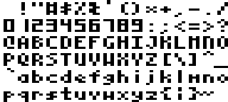
It contains the complete 7-bit ASCII character set, and it has been tuned for a fairly good readability, especially on CRTs. OTOH, it's probably as generic as it could get: there are only so many variations possible on most of the glyphs, and any 'fancy' design would ultimately turn out as just being hideous. I fixed the capitals at 6 pixels and the lower case letters mostly at 4 pixels height *), save for those with ascenders and descenders - and in the latter case, a compromise for 'g', 'p', 'q' and 'y' was inevitable. Furthermore, I wanted to keep the letter "O" rounded, and as it was necessary to keep 0 and O clearly distinct, all numerals were derived from an assumed 7-segment-display. The digit "1" had to follow suit and so the letter "l" just sets itself apart from it by a different horizontal position within the 4x8 box.

I *chose* the encoding to be ASCII, not PETSCII, for mainly two reasons: the main body of text out there is encoded in ASCII, so there's no extra conversion step necessary (which would anyway be incomplete, as both encodings miss out glyphs from the other one), furthermore didn't see any sense to include the 'graphic' characters of PETSCII as the font lives in a bitmap anyway, i.e. I can draw any graphic decoration besides text that I want. The text rendering engine would allow for extra, user defined double-width glyphs though, positioned at the standard 8x8 character positions (<- that might be important for your alignment, sex, etc. symbols).

However, given that RQ5 has already progressed that far, I wouldn't find it sensible to throw over one of the most fundamental design decisions that went into the game right from the beginning, the defined screen layout. Changing the display to use a 4x8 font would imply a costly redesign (and one doesn't replace the basement, when the house has already been erected, right? ;))

But this font might come handy for anyone's next game or other production. :)

Greetings,

Michael


*) I've seen *a lot of* other attempts at 4x8 fonts which even don't get this simple thing right: when reading continuous text, the eye glides along the upper edge of the small letters, and if you make them an uneven height the reading flow is extremely disturbed!

Re: Work in progress: REALMS OF QUEST V

Posted: Thu Apr 27, 2017 1:28 pm
by R'zo
Personally I like the Legacy font but I will probably play through with the intended Deluxe font. It is a little rough on the eyes but really fits the atmosphere of the game.

Re: Work in progress: REALMS OF QUEST V

Posted: Fri Apr 28, 2017 3:58 am
by Mayhem
It's very similar to the fonts used by the Apple II ports on the C64 such as Bard's Tale :)

Re: Work in progress: REALMS OF QUEST V

Posted: Fri Apr 28, 2017 12:35 pm
by Ghislain
Mike wrote:However, given that RQ5 has already progressed that far, I wouldn't find it sensible to throw over one of the most fundamental design decisions that went into the game right from the beginning, the defined screen layout. Changing the display to use a 4x8 font would imply a costly redesign (and one doesn't replace the basement, when the house has already been erected, right? ;))
That is pretty much it -- and besides, I choose the VIC-20 deliberately because I quite like it's aesthetics as far as the screen size goes (it provides the shape closer to a square rather than a rectangle in terms of rows vs columns).

I continue work on my 128 * 128 world map. Admittedly, I find it very difficult to do. I am using NotePad++ and here is a screenshot of my work so far. Obviously once I fill out the rest, I will be refining it, rounding out rough corners, adding more rivers and creating a 'highway' system of sorts to connect the disparate parts of the map.
realms5.jpg

Re: Work in progress: REALMS OF QUEST V

Posted: Fri Apr 28, 2017 9:36 pm
by R'zo
Definately the largest world map i've seen to date for the vic.

I remember trying out r.o.q. 3 a couple of years ago not long after I first gotime my vic. I remember thinking that this is probably about as much as you can get out of the vic concerning at least what can be done with this style of rpg. You are truly out doing yourself.

Re: Work in progress: REALMS OF QUEST V

Posted: Sat Apr 29, 2017 7:18 am
by Ghislain
R'zo wrote:Definately the largest world map i've seen to date for the vic.

I remember trying out r.o.q. 3 a couple of years ago not long after I first gotime my vic. I remember thinking that this is probably about as much as you can get out of the vic concerning at least what can be done with this style of rpg. You are truly out doing yourself.
As I continue to work on this game, the more I realize that the likes of Richard Garriott (of Ultima) and the original programmers of Wizardry were practically geniuses for what they were able to accomplish. I have the benefit of hindsight, the internet (to look stuff up), emulation and the modern PC to do cross development on. They were practically kids in their early 20s who only had the Apple II to work on.

I'm considering changing the party display to exclude the character numbers and put the players' health status there. I think it would be easier for the player to immediately find the health status right to the immediate left of the name (rather than look in between the HP and SU). This would also allocate one more digit space to display hit points in case a player ever achieves more than 999 of them. I also changed the text of the character names from white to yellow on the main screen -- just to distinguish them from the regular text.

Let me know what you all think of this change.
realms5.jpg

Re: Work in progress: REALMS OF QUEST V

Posted: Sat Apr 29, 2017 7:57 am
by rubygolem
The changes are good. Health status to the left of the name will be useful.